I’m not sure of the reason – although the humid weather might be a cause – but I’m feeling particularly stressed-out today, a feeling that has increased during the afternoon. Despite this, I did manage to develop a roll of film during my lunchbreak, and also started scanning som 120 Kodak Gold negatives when I finished work (although that process was not going smoothly, so I packed it in before my stress levels increased further).
I’ve not much to say about today’s picture other than this large fibreglass sheep was stood outside a shop I passed when on a day out with my wife last month. It was striking enough to make a picture.
I guess that this is a similar picture to the one I posted yesterday. This one is overexposed though. It’s overexposed because I mistakenly set the 35 RC to an f/2.8 aperture instead of the A (for auto) setting that would allow it to meter correctly in it’s standard shutter-priority mode. As a result this picture (and a couple of others) got far too much light. The other couple I’ve discarded in terms of posting them anywhere but I still quite liked this shot so I did what I could to recover it.
The photo also appeared in Flickr’s Explore section today, which I was a little surprised by. I get pictures selected for Explore on a reasonably regular basis (probably one a month or so) but they are rarely the photos that I think are my best. In fact, they’re often the ones I like the least. I have no idea how Explore selects it’s photos.
Whenever I get a photo in Explore I always get lots of comments from people congratulating me on the achievement. I’m grateful if people like my photos, but these people rarely seem to then venture into my feed to look at the other (arguably better) pictures. It’s almost as though anything not in Explore is somehow sub-par and not worth bothering with.
I don’t tend to look at Explore very often – usually it’s only when one of my pictures is featured and I’m feeling nosey as to how far down the selction it appears. There are a lot of very nice photos featured, but there are also a lot of obvious pictures too, as well as some bizarre choices from time to time. However, if I do find one I really like then I will go and look at the feed of the photographer as sometimes this introduces me to new bodies of work I really enjoy.
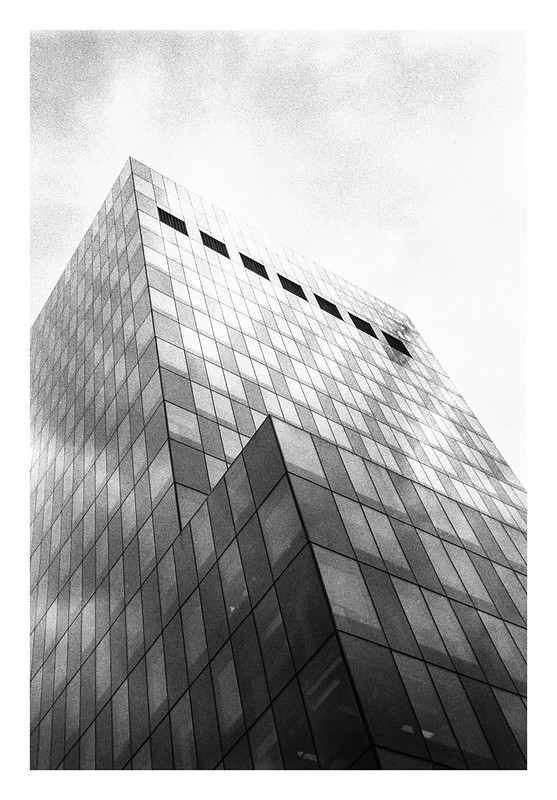
I had an appointment this afternoon and didn’t get home until recently, so just a quick post today with a photo of a Tetris-like building in Manchester.
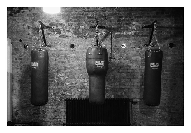
These punchbags were in a room adjacent to one of the leather chairs I posted pictures of yesterday. Although I never saw anyone punching them, each time I went past the three bags would be swinging slightly. Clearly ghosts were to blame. There can’t possibly be any other rational explanation to this mysterious event. 🙂
These two vacant leather chairs were positioned in a couple of the basement rooms of the old warehouse building where the Photo North event took place last month. I liked something about them them enough to take photos.
This is the second in my series of expired film shoots. You can find a link to the others at the bottom of this post.
This second roll is a little younger than the last one I shot, but not by a huge margin, and it’s still over thirty years beyond it’s expiry date. It’s also a colour film, a fact that I’ve found can more adversely affect the resulting photographs. I find that expired black and white film is generally far more forgiving than colour. There are a number of things that can go awry with either format but, in general, it’s much easier to overlook a change in tonality in black and white than it is in colour. The reason is in the name: colour. While most people probably can’t tell if a greyscale tone is not totally accurate, they are far more atuned to when colours don’t look right, and expired colour film can bring a whole range of potential colour defects to bear on an image, with deterioration of the different dye layers resulting in a range of colour changes that the human eye easily picks up on.
An increase in grain is another thing that can occur with expired film and, again, is something that is less of a problem in black and white than colour. Sometimes grainy colour images can look great – look at Anton Corbijn’s colour pictures as an example – but in my own work, additional grain and colour noise in colour photographs tends to look muddy and unattractive.
Taking these things into consideration, I generally have a lot more trepidation when shooting expired colour film, and the faster the film, the worse these things can become as the addtional sensitivity can increase the possible deterioration.
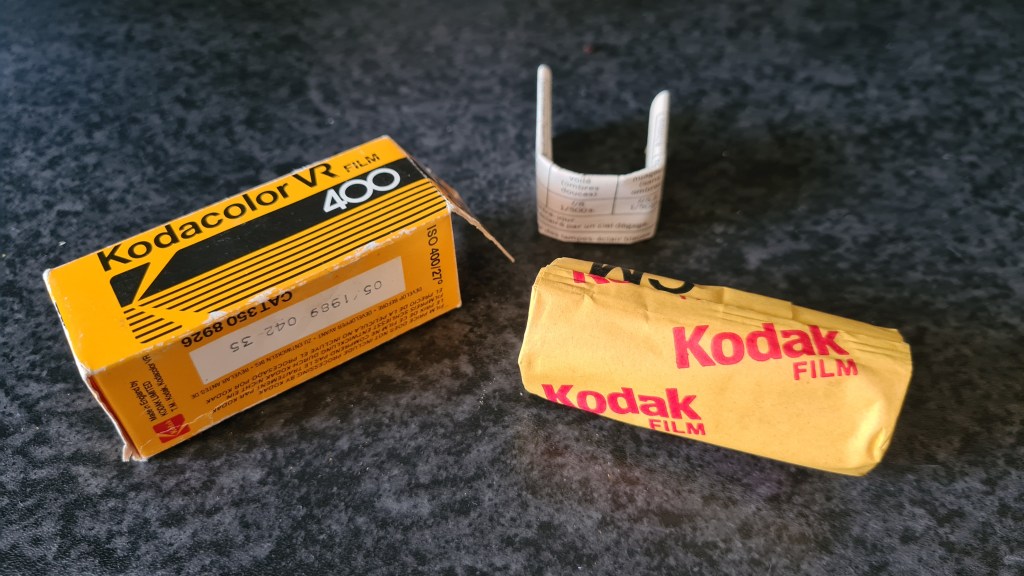
For this installment I chose a roll of Kodacolor VR 400 which expired in May 1989, so 33 years past it’s recommended best when I shot it. As I don’t know how the film has been stored throughout it’s life I used the generally accepeted rule of thumb to overexpose it for one full stop for each decade of expiry and metered it at 80asa.
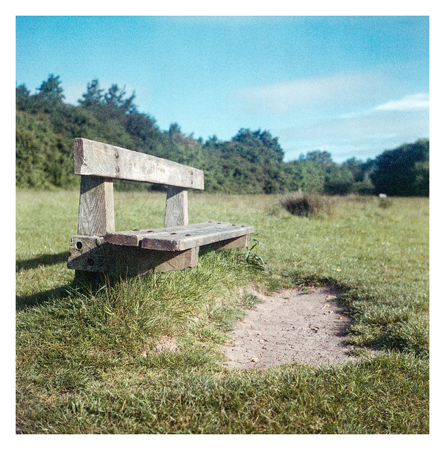
As with the last roll of expired film I shot, I decided to use my Yashicamat 124G again. This time though I decided to stay relatively close to home for the shoot and headed out to the local country park, which is about ten minutes away by foot. The weather was nice and bright but as I was shooting at 80asa I took my tripod with me in the event I needed to use slower shutter speeds. I managed to forget a cable release but, thankfully, none of the exposures was slow enough to be impacted by any camera shake from my pressing the shutter button with my finger.
All the shots were made either on my way to the park, at the park, or on the way home, all in the space of an hour or so.
As I don’t develop my own colour film as yet, I took the exposed roll to my local lab. I had a momentary pang of disappointment when I was told that it might have to be developed in B&W chemicals if there was a risk of the old film contaminating their C41 chems, but I was happy to discover colour negatives when I collected the developed film the next day.
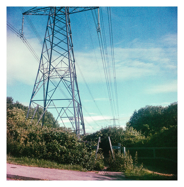
The negatives were scanned at home on my Epson V550 flatbed scanner and converted to positive images with Negative Lab Pro. The scans had some noticable colour shifts but this was easily recovered in the conversion process. The resulting images are vibrant with good, albeit perhaps not completely accurate, colours. There is increased grain, most notably in the shadow areas but given the age of the film, nothing too bad.
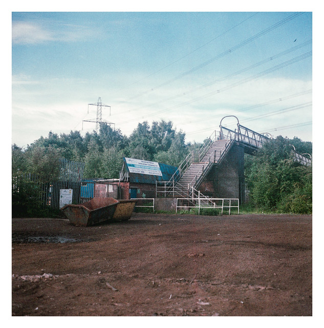
I was very pleased with the results and managed to get twelve very useable images, with a few that I especially like – the shot of the steps being my particular favourite.
The first shot on the roll and perhaps the one that most noticeably shows the worst of the colour shifts.
I tried to shoot with wide apertures where possible, mostly because I don’t tend to shoot that way with te Yashicamat much, but usually like the look when I do.
More use of a shallow depth of field.
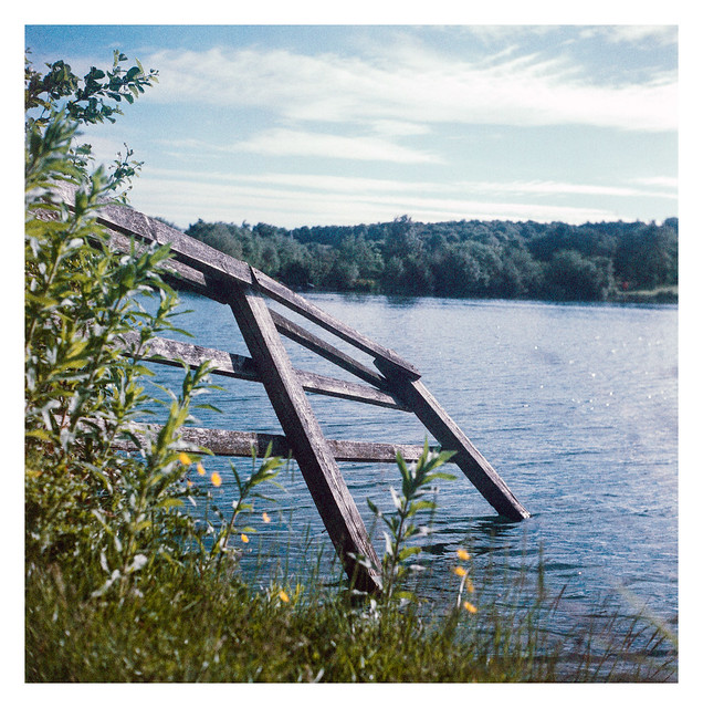
I’ve photographed this short stretch of fence in the water on several occasions. It always tends to produce a picture I like.
The water here was a lovely aquamarine to my eyes but it hasn’t been captures well in the photograph unfortunately.
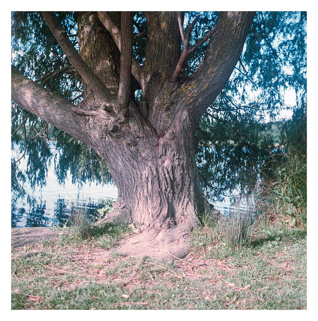
Another favourite from the roll. The greens of the grass look lush and the shallow depth of fiels makes the image pop.
I like this one, but it would have worked better with a shallower depth of field I think. Even at 80asa however, the light was too bright to open the aperture too much without busting the camera’s maximum 1/500sec shutter speed.
I wasn’t sure about this when I took it, but I think the contrast between the bright orange of the plastic netting and the organic greens of the reeds works well.
My favourite from the roll.
I love the richness of the brown soil in the foreground of this picture.
Overall outcome: Success!
Expiriment #3 coming soon…
Yashicamat 124G, Kodacolor VR 400 (expired 1989). Shot at 80asa and lab developed for box speed.
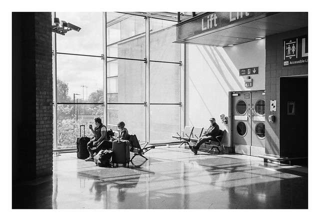
Back near the start of May I visited the Photo North photography festival in Manchester. Rather foolishly I didn’t allow enough time to enjoy it thoroughly and, to make matters worse, the train there was delayed too. As a result, instead of walking to the location as planned, I ended up grabbing a taxi. The light in the station was really nice as I made my way to the cab rank, and I grabbed a few photos, including the one published here today.
I guess you could just read yesterday’s post to find out what this picture is about. It’s a photo of another piano in the same location. I’m making this a quick post because it’s very hot here today and I haven’t got it in me to sit and write anything lengthier. 🙂
Many railway stations here in the UK, or at least the larger ones with sheltered concourses and departure areas, tend to have a piano (sometimes several) on which members of the public can exercise their musical talents (or lack thereof). This one is at Manchester Picadilly station – and there’s at least one more at this station.
This is a shot from the first roll I’ve shot through my Olympus 35RC in far too long. My XA3 seems to have gotten much of the love over the past year, but even before I got that camera, the 35RC had languished for longer than I liked. I’ve shot this roll with it and currently have a half-finished roll of FP4+ loaded. It’s a great little camera and deserves some use.
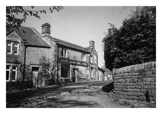
The light falling on this shopfront – a combination of contrasty tones and shadows from the trees to the left of frame – attracted me to make the picture. It’s a shame that the shop is not trading, but I guess that’s the way the country is changing. Demographically, villages like this are altering, and combined with that a change in shopping habits and the introduction of online shopping, means that trading conditions have become much more difficult for such stores. Hopefully it will re-emerge in some new guise.