A few days back I was bemoaning the results from Portra 800 shot under dull, overcast conditions and how I’d thought about converting them to black and white.
On the same day that I made those pictures, in the late afternoon as we were heading back to the car the skies began to clear, the day turned bright and summery, and I was able to shoot the final two frames of the roll under these brighter conditions. The results (as seen below) are, I think, far preferable.
Despite it’s professional quality (and exhorbitant price point), I really don’t think that Portra 800 suits dull conditions much. It’s 800asa rating might say otherwise, but I think the results are lacklustre (albeit with the caveat that I’ve not actually shot much of the film, so maybe it’s the operator at fault here). The day before I shot the Portra, I’d shot some Kodak Colorplus 200 under similar conditions with my Olympus Trip 35 and much preferred those results, despite it being a cheaper, consumer-grade film.
I’ve since shot another roll of Portra 800, this time on a bright day while rating it at 400asa, and found those to be much nicer. I’m not sure I’d go out of my way to buy more of the film – I’d probably just go for it’s slightly cheaper stablemates Portra 400 and 160 and avoid shooting on dull days. The other Portra 800 shots will be along in the next week or so.

Nikon F80, Nikkor 28-80mm f/3.5-5.6 D & Kodak Portra 800. Lab developed. Home scanned and converted with Negative Lab Pro.
Taken on 29 July 2022

These ones are certainly more cheerful!
LikeLiked by 1 person
Yeah, I agree. I have nothing against moody bad-weather pictures – I make a lot of them! – but I tend to find they work better in B&W (to my eyes, at least).
LikeLike
I’m a big fan of Portra 800, but, like you, I do believe it works best with some actual sunlight. The reason I like it so much is not because of its high sensitivity. Rather, it’s because of its beautiful, more traditional looking grain structure. Obviously, at normal resolutions and/or print sizes this structure isn’t really seen, but in a high quality, high resolution scan, or a large optical print, it is, and its amazing, in my opinion. It is much more pleasing than the grain structure of either Porta 400 or 160. I don’t even like the 400 variety and it’s always been a mystery to me as to why everyone seems to love it so much. In my opinion, it has zero character or outstanding features that make it worthwhile. Impressive as it may be from a technical standpoint, it just looks sterile and lifeless to me. Portra 160, however, is a very attractive stock in its own right. I like it a lot more than Ektar. That said, they’re now all way out of my price range, like all color film is, even the consumer stuff. It’s a shame.
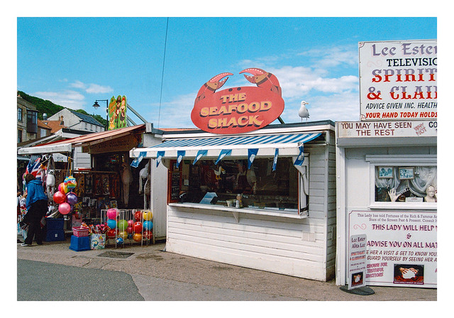
In that first shot, I like the real seagull sitting on top of “The Seafood Shack,” while inside “the shack” there is a fake one with its beak in a cup, presumably going after the food. I find that quite humorous. The photo of the old wooden boat is simply beautiful. Very nicely done, on both fronts.
LikeLike
Thanks P. I’ve not actually shot that much of any of the Portra varieties. A bit more 400 than 160, and only a couple of rolls of 800 (with one more in the freezer). The 800 that I overexposed by a stop looks pretty nice, but I’d probably still choose the 400 variety given the price difference (and I’m not likely to be shooting much of that either for the same reason!). I have several rolls of 160 in the stash though – in both 135 and 120 – so that should keep me going for a while.
LikeLike