I’ve been less than impressed by the results of this roll of Portra 800 primarily (I think) because it was shot under dull, overcast conditions. The resulting images are muddy and unappealing to my eye and I’ve spent some time seriously considering converting them to contrasty black-and-white versions in Lightroom and ditching the colour altogether.
While this does give more impactful images for many of the frames, the fact that this is a colour film (and a very expensive one at that!) means I’m somewhat reluctant to do so – I might have well have just used some cheaper black-and-white film in the first place (I really wish I’d taken some B&W rolls with me but I didn’t, because I am a fool).
I’ve uploaded converted versions of the colour originals at the bottom of the post. Which do you prefer?
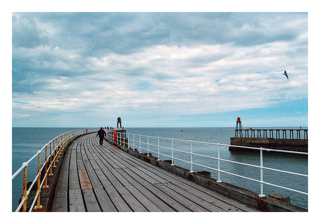

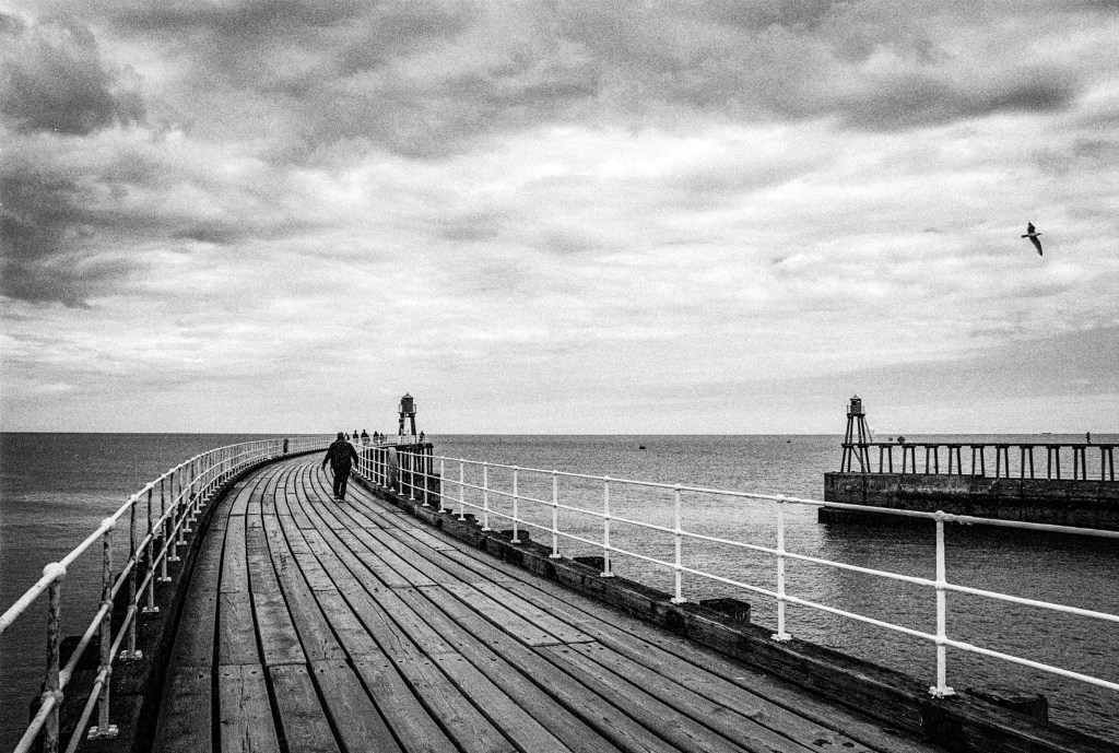
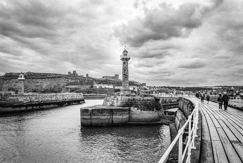
Nikon F80, Nikkor 28-80mm f/3.5-5.6 D & Kodak Portra 800. Lab developed. Home scanned and converted with Negative Lab Pro.
Taken on 29 July 2022.

I prefer the colour originals. I think they showcase the mood in the sky.
LikeLiked by 1 person
Thanks Khürt.
LikeLike
I agree with Khurt, but then I prefer to work in colour anyway. One of my favourite paintings is a very old watercolour that was my Grandmothers. A very similar scene in a coastal port, in the days of sail. There are people on the jetty, fishing boats alongside and at anchor. And the moody colour of a very grey day, very similar colours to your photos. It is what it is, and your images capture it perfectly. The clouds are not blown out, rather moody and slightly menacing. Great photos!
LikeLike
Thanks Steve. I’m glad that it evoked these feelings. I think I have an inbuilt bias (and also a sense of inadequacy at producing good results) when it comes to using colour film on gloomy days. I’ve got some Superia 400 shots coming soon that were made on the same trip, although I think I prefer those to these Portra 800 images.
LikeLike